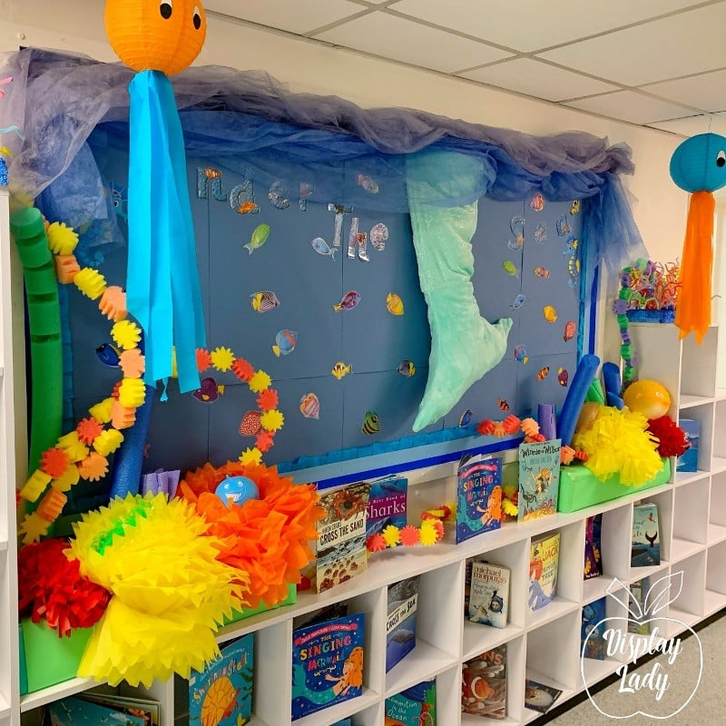
Top tips for creating display boards
If you follow our Instagram account you’ve probably seen our reels with Display Lady. Lois of Display Lady is a former primary school teacher and shares her passion for creating beautiful display boards on her Instagram account, which has over 26,000 followers. You can learn more about Lois here.
We’ve pulled together her top tips for creating display boards and listed them below. Take away her brilliant hacks and ideas to make amazing creations of your own with wonderful displays for your classroom.
Tips for creating your display board
Tip one:
Back your display boards by layering the paper from top to bottom. Hang your paper either portrait or landscape and don’t mix it up as this can look messy and cause shadows. Make sure the lines are aligned on the board to keep it neat.
Tip two:
Hang up roller boards like wallpaper. Staple along the top and smooth down, then cut along the bottom.
Tip three:
Separate your corrugated borders after you measure it against your board. Measure it against the board on one side, cut it to size then separate it out, so you have two perfect ends for the sides. Repeat for the top and bottom.
Tip four:
If your display board has a metal edge, border along the inside of the edge first, go all the way around and then take your second border and attach that to the metal edge. This will ensure you’ve got the same distance between both borders all the way around your board. Don’t forget to do all the inner border before you do the outer border.

Tip five:
When mounting work to your display, add the piece of paper to your coloured backing paper then use a guillotine and line up the piece of paper not the mounting paper when cutting, this will ensure you get the same distance all around the page.
Tip six:
This is a great hack to use at the start of the school year – use a measuring tape to measure the top of the display board and find the centre point. Mark it with a pencil above the board. Going forward you will always find the middle, perfect for keeping things symmetrical.
Tip seven:
When adding letters to your display, always cut out the middle as it looks much better against the contrast backing paper. It’s a pain to do but well worth the effort.
Tip eight:
When choosing colours for your board, use a colour wheel to help you decide which colours complement each other. You could also think about the topics and use a colour theme for that. For example, with a rainforest theme, think about greens, blues and earthy tones and for space consider purples, blues and black. Pinterest is a great source of inspiration and can help you decide which colours match your theme.
Let us know how you get on with your classroom displays on our Facebook or Instagram, share your ideas and let us know which tips you found helpful?
For more display inspiration check out our craft your own firework display blog, perfect for getting ready for bonfire night.