The connection between colours and certain moods has interested scientists and psychologists for a long time. But can colour psychology apply to education and learning, and how can we apply that to the classroom?
In this article, we’ll run through which colours are associated with education, and what impact you might expect on your class if you bring them in.
Colours associated with learning
From calming greens to invigorating oranges, these six colours are an excellent choice if you want to inject a certain mood into the classroom or a particular task.
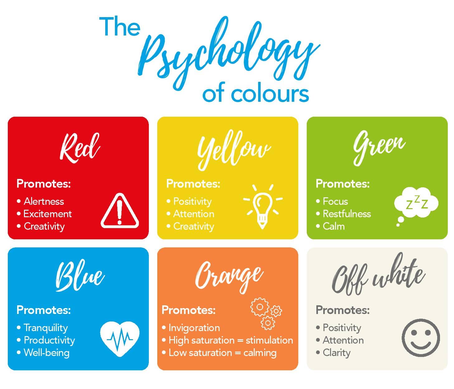
Red
Famously, red has established a psychological connection to success in sports. Many studies support (like this one from the University of Durham) the idea that famous football teams like Manchester United and Liverpool may be at an advantage by wearing red. The colour is associated with virtues like vitality, energy and passion, helping to develop performance in physical activity.
You can take advantage of this in an educational setting by using red to promote alertness and excitement in an active task.
Promotes:
- Alertness
- Excitement
- Creativity

Yellow
Like the sun that shines on us through the clouds, yellow has often been considered the happiest colour of them all. Used as a sign of hope and optimism, yellow is a good choice for creating a sense of cheerful positivity around the classroom.
Promotes:
- Positivity
- Attention
- Creativity

Green
Green has many positive associations related to growth and nature. It’s often used in marketing to convey prosperity, due to its connection to money, or responsible, environmentally friendly business.
The link between green and nature brings a sense of calm and restfulness. It empties the mind and focuses our attention. These are the connotations you can take advantage of when focusing a class on their task.
Promotes:
- Focus
- Restfulness
- Calm

Blue
Surveys (like this one from YouGov) around the world have shown that more people’s favourite colour is blue than any other colour. It is believed to be due to reminding us of the tranquillity of the sky and the sea. Other studies have shown that it makes us feel more comfortable, resulting in shoppers spending longer buying and even crime decreasing in blue-lit streets.
It’s also thought that highly successful people work better in blue environments – something you might consider in your classroom. The sense of calm and positive well-being that comes from blue allows us to be more creative and more productive when learning.
Promotes:
- Tranquility
- Productivity
- Well-being

Orange
The psychology of orange borrows heavily from the two colours that are in its makeup – yellow and red. Symbolising energy and stimulation, orange is perfect for an invigorating “can-do” attitude, with some suggesting that exam halls should be painted this colour to aid pupils sitting tests. It’s also why you see orange often used in DIY-related businesses (think B&Q).
Much like red, orange can be used to stimulate a positive can-do attitude. Just be sure to use high saturation oranges; those that are low saturation are more associated with calm.
Promotes:
- Invigoration
- High saturation = stimulation
- Low saturation = calming

Off-white
Off-white, and white more broadly, have an interesting mix of positive and negative connotations. White walls are used to make rooms look bigger and more spacious, but it can also make them feel cold and bleak.
In an educational setting, off-white can help to promote feelings of clarity and improve levels of attention in class but be sure not to overdo it and leave a classroom feeling isolating and bleak.
Promotes:
- Positivity
- Attention
- Clarity

Ideas for incorporating colour into the classroom
Now we’ve matched up the colours and their respective moods, how do we incorporate it into learning? Here are just a few ideas to get you started:
- Consider an accent wall in the classroom. Accent walls are painted a distinct colour that is different from the rest of the room. They can be used to effectively draw attention to a display or a certain part of the room.
- Colour psychology can differ depending on the individual, with the connotations of some colours changing over time or cultures. Discuss colour psychology in your class and find out if the next generation of learners agrees with long-held views.
- Display art in your classroom that involves the colours you wish to focus on. Ask your class why artists use certain colours in their work, and what they are trying to achieve by doing this.
- Even your clothing can influence the mood of your class. A yellow or off-white shirt will increase the level of attention pupils give to you when you’re speaking.
- Need to draw attention to a certain aspect of the room? Get inventive and add something orange to draw the eye. Think placemats, flowers, or even stationary organisers.
- Bright colours are great for eye-popping displays, but for quieter areas like reading corner, you need to exude calm. Add some blue cushions or green seating to create the tranquillity and focus.
- For arty, creative activities that need a bit of energy and spark, consider going red. An energetic art station is the perfect environment to get these kinds of creative juices flowing.
- If blue is the king of productivity, then why not hand out blue exercise books when you’re about to start an important lesson. The shift in state-of-mind will help them focus on learning and improve their note-taking.